Writing about Percentages
When you deal with pie charts you nearly always have to write about percentages. Here are some useful sentence structures/ phrases for describing percentages:
The largest proportion was for __noun___, accounting for ___% of the total.
The smallest proportion was for __noun___, accounting for ___% of the total.
The amounts of ____noun____ and ____noun____ were similar, making up ___% and ____% respectively.
___Noun___ had the lowest amount of sales at __%.
___Noun___ had the highest amount of sales at __%.
Regarding ___noun___, little change could be seen with a difference of just ___%.
As regards ___noun___, there has been a huge change over the years.
Structure of Answer
Here you have two pie charts, so use four paragraphs:
Introduction – rephrase the question in your own words and also the titles of the pie charts.
Pie Chart 1 – describe the percentages of the items the chart is referring to. You might only choose to talk about the lowest and the highest – whatever you think it most important.
Pie Chart 2 – because you have dates here and the question asks you to ‘make comparisons where relevant’ you could choose to compare this chart to the first pie chart and describe how the proportions/ amounts have changed. You could also simply compare between the items in pie chart 2 by using ‘more than/ less than/ the most/ the least’. It is your choice. Here, I have described how the proportions have changed in comparison to 2003 but I have also compared between the items in pie chart 2 alone.
Overall statement – write what the overall/ general pattern or observation is and if you have not done in the main body, maybe try to compare between the two charts.
Test Yourself
Try to put the missing phrases back into the gaps. Each space _______ is for one phrase. Look at the question as well as the example sentences above to help you. The answer is on the final page so do not look!
the largest proportion
not drastically
little change
24%, 21% and 19% respectively
accounting for
with a difference of just
the lowest amount
show the differences
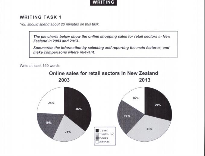
This report will summarise the information presented on two pie charts, which ______________________ in sales made online in the retail sector of New Zealand for the years 2003 and 2013. The categories of items sold include travel, film/ music, books and clothes.
In 2003 ______________________ of sales was for travel, ______________________ 36% of the total. The amounts of the other three items sold were similar with clothes, film/ music and books making up ______________________.
By 2013 the proportions had changed, although ______________________. Film/ music became the biggest seller with 33% of the total whilst clothes had ______________________ of sales at 16%. Regarding books, in a decade little change could be seen ______________________ 3% whereas the sales of film/ music increased from 21% to 33%.
Overall, it can be seen that in general there has been ______________________ over the years as regards the characteristics of the online retail sector in New Zealand.
Download the file to find the answer and the complete example essay.
When you deal with pie charts you nearly always have to write about percentages. Here are some useful sentence structures/ phrases for describing percentages:
The largest proportion was for __noun___, accounting for ___% of the total.
The smallest proportion was for __noun___, accounting for ___% of the total.
The amounts of ____noun____ and ____noun____ were similar, making up ___% and ____% respectively.
___Noun___ had the lowest amount of sales at __%.
___Noun___ had the highest amount of sales at __%.
Regarding ___noun___, little change could be seen with a difference of just ___%.
As regards ___noun___, there has been a huge change over the years.
Structure of Answer
Here you have two pie charts, so use four paragraphs:
Introduction – rephrase the question in your own words and also the titles of the pie charts.
Pie Chart 1 – describe the percentages of the items the chart is referring to. You might only choose to talk about the lowest and the highest – whatever you think it most important.
Pie Chart 2 – because you have dates here and the question asks you to ‘make comparisons where relevant’ you could choose to compare this chart to the first pie chart and describe how the proportions/ amounts have changed. You could also simply compare between the items in pie chart 2 by using ‘more than/ less than/ the most/ the least’. It is your choice. Here, I have described how the proportions have changed in comparison to 2003 but I have also compared between the items in pie chart 2 alone.
Overall statement – write what the overall/ general pattern or observation is and if you have not done in the main body, maybe try to compare between the two charts.
Test Yourself
Try to put the missing phrases back into the gaps. Each space _______ is for one phrase. Look at the question as well as the example sentences above to help you. The answer is on the final page so do not look!
the largest proportion
not drastically
little change
24%, 21% and 19% respectively
accounting for
with a difference of just
the lowest amount
show the differences
This report will summarise the information presented on two pie charts, which ______________________ in sales made online in the retail sector of New Zealand for the years 2003 and 2013. The categories of items sold include travel, film/ music, books and clothes.
In 2003 ______________________ of sales was for travel, ______________________ 36% of the total. The amounts of the other three items sold were similar with clothes, film/ music and books making up ______________________.
By 2013 the proportions had changed, although ______________________. Film/ music became the biggest seller with 33% of the total whilst clothes had ______________________ of sales at 16%. Regarding books, in a decade little change could be seen ______________________ 3% whereas the sales of film/ music increased from 21% to 33%.
Overall, it can be seen that in general there has been ______________________ over the years as regards the characteristics of the online retail sector in New Zealand.
Download the file to find the answer and the complete example essay.
| WRITING TASK 1: PIE CHARTS - DESCRIBING PERCENTAGES |
Vocabulary:
accounting for = equal to
just (adv) = only
proportion (n) = amount
category (n) = group
characteristic (n) = feature
accounting for = equal to
just (adv) = only
proportion (n) = amount
category (n) = group
characteristic (n) = feature


 RSS Feed
